Fact-checked against ABS — Consumer Price Index on 2026-04-25.
Ever noticed how the inflation number on the news rarely matches what your own week feels like? You’re not imagining it. The headline CPI is sound – it’s built carefully and it measures real things. But it describes a whole country, and you don’t live like a whole country. The gap between the official figure and your felt experience is structural, it’s predictable, and it comes down to one thing: what you actually spend your money on. This guide walks through how the number is built, why your version differs, and how to find a figure that fits your household.
What inflation actually is, in plain terms
Inflation is simply the rate at which prices rise, on average, across a fixed basket of goods and services over time. In Australia the headline measure is the Consumer Price Index, or CPI, and the Australian Bureau of Statistics publishes it every quarter. So when you hear “3% inflation”, it means that basket cost roughly 3% more this quarter than it did in the same quarter a year ago. That’s it.
Here’s where it gets interesting. That basket is the whole concept – it decides what the number actually means. And the ABS reweights it from time to time to match what households really buy. So “the inflation rate” isn’t a fixed thing; its meaning quietly shifts as our spending habits change.
For most of the past three decades, Australian inflation has stayed within a few percentage points of the RBA’s target band. There have been clear exceptions – the post-2022 period being the freshest in everyone’s memory. But over the long run it’s been fairly steady, more so than in plenty of comparable economies.
How the ABS measures inflation – the CPI explained
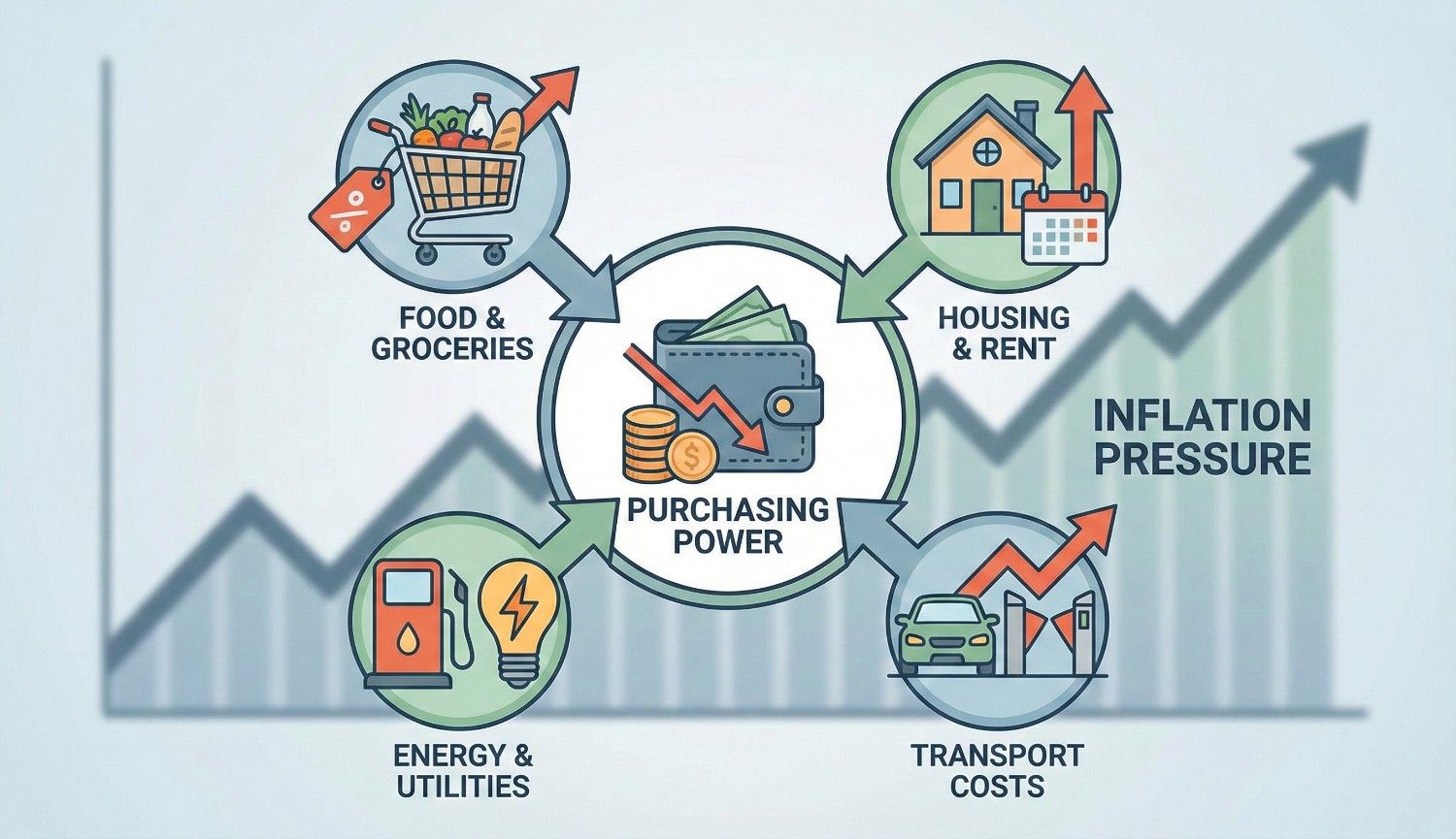
The ABS Consumer Price Index tracks the prices of around 100,000 individual items across 11 broad expenditure groups, in eight capital cities, every single quarter. Each item carries a weight that reflects its share of average household spending. Add up those weighted price changes and you get the headline figure.
The 11 expenditure groups are:
- Food and non-alcoholic beverages
- Alcohol and tobacco
- Clothing and footwear
- Housing – rent, new dwelling purchases, utilities, maintenance
- Furnishings, household equipment, and services
- Health
- Transport
- Communication
- Recreation and culture
- Education
- Insurance and financial services
Inside each group the ABS applies category-level weights drawn from Household Expenditure Survey data, updated periodically. So the final number reflects the average household’s experience, weighted by where the money goes. It is not a plain average of every price, and it is not the experience of any one household – including yours.
The ABS also publishes “underlying” measures, including the trimmed mean and the weighted median. These strip out the most volatile categories each quarter to show a smoother read on the real pressure underneath the noise – and the RBA watches them closely.
Why headline CPI feels different from personal inflation
The gap between the reported number and the felt one is built into the system. We all spend differently. The further your spending sits from the national average, the further your personal inflation drifts from the headline. It’s that simple.
Here’s how that divergence shows up in practice:
- Renters put a much bigger slice of their budget into housing than the population average, so when rents climb faster than CPI, renters feel far sharper inflation than the headline shows
- Families with young kids spend heavily on childcare and education, both of which follow their own price patterns
- Older households lean more on health and pharmaceutical items, which can move quite differently from the broader index
- Lower-income households spend a larger share on food and energy – the volatile categories that bite hardest when food and fuel prices jump
This is also why the ABS publishes “selected living cost indexes” for different household types – pensioners, employees, age pension recipients, and others – which often show inflation rates well away from the headline CPI. You’ll find them on the same price indexes and inflation portal, and they go a long way toward explaining the felt-versus-reported gap.
Who feels the gap most, and why
Pulling the divergence above into one view makes the pattern easier to see. The table below is built straight from the household types already described in this section.
| Household type | Where their spending concentrates | Why their inflation can diverge from the headline |
|---|---|---|
| Renters | Housing (rent) | A much higher share goes to housing than the population average, so when rents rise faster than CPI they feel substantially sharper inflation |
| Families with young children | Childcare and education | Both categories follow specific price patterns of their own |
| Older households | Health and pharmaceutical items | These can move differently from the broader index |
| Lower-income households | Food and energy | These categories are more volatile and figure prominently when food and fuel prices jump |
What the Reserve Bank of Australia does about inflation
The RBA is mandated to keep consumer price inflation between 2 and 3 percent on average over the medium term. The RBA inflation page lays out that target and the framework around it. Its main lever is the cash rate – the interest rate banks charge each other for overnight lending – which ripples out into borrowing costs across the whole economy.
Stripped right back, the mechanism works like this:
- When inflation is running above target, the RBA can lift the cash rate. Borrowing gets dearer, spending cools, and inflation eventually eases
- When inflation is falling or stuck below target, the RBA can cut the cash rate. Borrowing gets cheaper and spending picks up
Here’s the part most people miss: rate changes hit inflation with a lag of around 12 to 18 months, a point the RBA flags in its own published framework. So a decision made today is shaping inflation a year or more out – not the figure in this quarter’s CPI. The medicine takes a while to work.
The RBA’s measures-of-CPI page sets out how the bank reads the various ABS series – headline, trimmed mean, weighted median – to gauge the underlying pressure.
Which spending categories drive felt inflation
A handful of categories do most of the work in pulling your personal inflation away from the headline. These are the ones worth keeping an eye on:
- Housing – rents and new-dwelling-purchase costs are big weights and they swing hard with the property cycle. Covered in our rent and housing costs explainer.
- Energy – electricity and gas sit in just a few categories, but they hit lower-income households out of proportion to their size
- Insurance – premiums for home, contents, car, and health have outpaced headline CPI in many recent periods
- Education – tuition, school fees, and after-school activities land squarely on families with children
- Healthcare – gap fees, private health premiums, and out-of-pocket costs weigh most on older households (covered in our healthcare costs article)
The striking thing is just how concentrated this experience is. Two households on similar incomes can land on wildly different personal inflation rates depending on whether they own or rent, have kids, drive long distances, or carry high health costs. The headline figure blends all of them together. Your life doesn’t.
What matters most, in order
If you want to work out why your own costs feel the way they do, run through these in order. Each step uses only the levers described above and earlier in this guide.
- Housing first. It’s the largest weight and the most cyclical, so whether you rent or own moves your personal inflation more than anything else.
- Energy next. Electricity and gas are small categories that punch above their weight, especially on a tighter budget.
- Then your fixed-but-rising bills. Insurance premiums have outpaced headline CPI in many recent periods, so they quietly compound.
- Life-stage costs. Education if you have children, healthcare if you’re an older household – these are the category-specific hits.
- Everything else. The remaining groups in the basket tend to track closer to the headline figure.
How Australian households actually respond to inflation
When prices keep rising, households push back in fairly predictable ways:
- Substituting cheaper goods within categories (private label for branded, smaller pack sizes)
- Reducing discretionary spending – eating out, recreation, holidays
- Renegotiating fixed costs – switching insurers, energy retailers, mobile providers
- Shifting saving and investment patterns as real returns change
- Asking for wage increases or changing jobs to capture higher pay
That last one, the wage-and-job response, tends to lag inflation by months or even years – wages adjust more slowly than prices in most cycles. It’s a big part of why “real wages”, meaning wages adjusted for inflation, can actually fall during an inflationary stretch even while your nominal pay goes up.
For lower-income households on fixed incomes – think Centrelink recipients and age pensioners – the options are tighter, because the income side barely moves. That’s why most Centrelink payments are indexed: the rates lift periodically in line with measured inflation, though usually with a lag. We unpack how those payments work in our Centrelink payments explainer.
Frequently asked questions
Why does inflation feel worse than the official rate?
Headline CPI is a population-wide weighted average of price changes across a defined basket. Individual households spend differently — renters spend more on rent, families spend more on childcare, older households spend more on healthcare. Households whose spending is concentrated in fast-rising categories experience higher personal inflation than the headline figure suggests.
Who measures inflation in Australia?
The Australian Bureau of Statistics (ABS) measures inflation through the quarterly Consumer Price Index. The Reserve Bank of Australia (RBA) monitors inflation as part of its monetary policy mandate but doesn’t measure it directly. The ABS publishes both the headline CPI and underlying measures that strip out volatile items.
What is the RBA’s inflation target?
The Reserve Bank of Australia targets keeping consumer price inflation between 2 and 3 percent on average over the medium term. The target is set in agreement with the Treasurer and is the central anchor for monetary-policy decisions, including changes to the cash rate.
The number that explains the felt-vs-reported gap
If you want one number that explains the gap between official inflation and your own experience, it isn’t the CPI. It’s the share of your spending tied up in fast-moving categories. Where housing, energy, and food together account for over 60% of a household’s spending, that household tends to feel consistently sharper inflation than the headline during inflationary periods – simply because those categories move faster than the basket average.
What that means on the ground is that cost-of-living pressure is genuinely uneven across the country. The ABS selected-living-cost-indexes, broken down by household type, are a far better personal-relevance check than the headline CPI for any one household. Look up the index that matches your circumstances and you’ll usually land on a figure much closer to what you actually feel than the front-page number.
So the practical move, when you’re sizing up your own cost-of-living squeeze, is this: find the ABS index for your household type (employee, age pensioner, working-age welfare recipient), compare its trend to wage growth, and treat that combination – not the headline CPI on its own – as the real measure of your changing purchasing power.
Reading a CPI figure: a quick worked example
Illustrative only. Say the headline CPI comes in at 3% for the year. That tells you the average basket cost about 3% more than a year ago. Now picture a renter whose budget is dominated by housing, one of the fastest-moving categories. Because their spending leans on a category that climbs faster than the basket average, their personal inflation lands above that 3% headline – even though the official number hasn’t changed. The fix isn’t to argue with the headline; it’s to pull the ABS living cost index that matches their situation and read that instead. (Figures used here are the 3% example already given in this guide; no other numbers are implied.)